Accessibility & Consistency
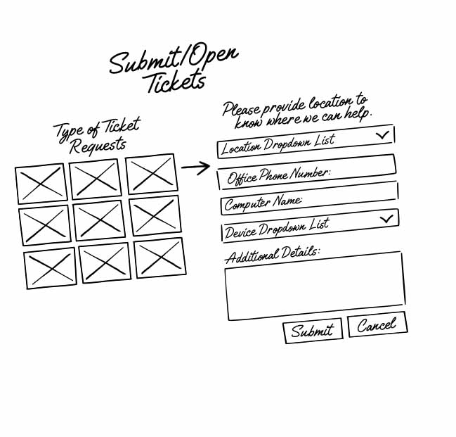
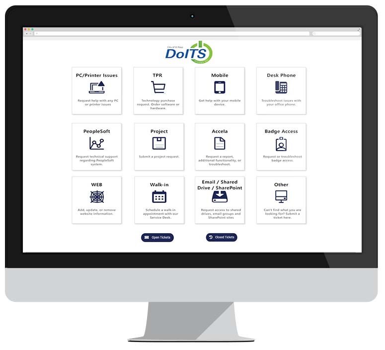
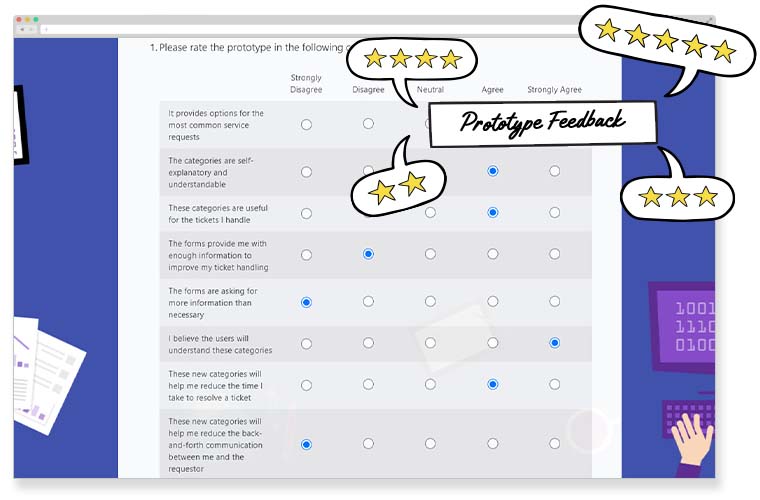
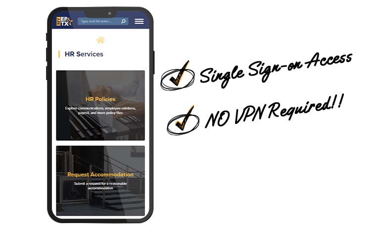
We interviewed dozens of users and opted to change the single "submit ticket" button and the single "description" field for dynamic forms and a navigational hub. This means that information is categorized, properly spaced, and uses a color neutral palette to improve readability and encourage discovery.
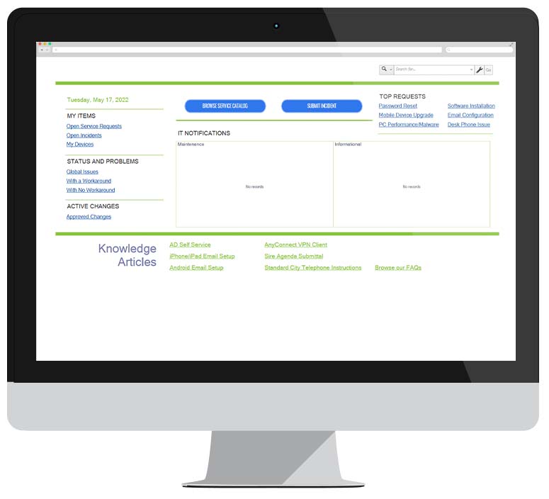
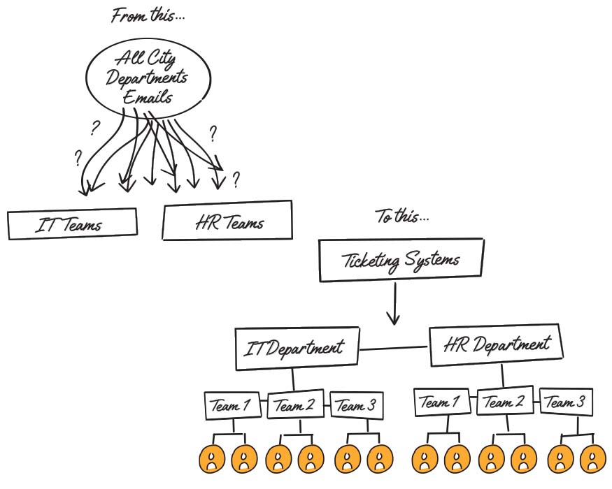
The city unfortunately uses a ticketing platform with very limited visual options, however, to the extent possible, HR and IT have transitioned to a navigational hub format with curated categories and automation, and to the extent possible, use the city's design guidelines.

